
Introduction
Real-time computing (RTC), or reactive computing is the computer science term for hardware and software systems subject to a ”real-time constraint”, for example from event to system response. Real-time programs must guarantee response within specified time constraints, often referred to as ”dead-lines”.
In this blog we implement a data collection and aggregation program for real-time performance monitoring system. The program is written in Python and uses Flask as a web framework. The program collects data from cyclictest and feeds it to Plotly for real-time visualization. The program is packaged as a Docker container and can be deployed on any Linux machine.
First, we demonstrate the design of the program. Then, we list the technologies used in this project. Finally, we conclude with a discussion of the results and future work.
Design
The program is designed to collect data from cyclictest and feed it to Plotly for real-time visualization. The program is packaged as a Docker container and can be deployed on any Linux machine.
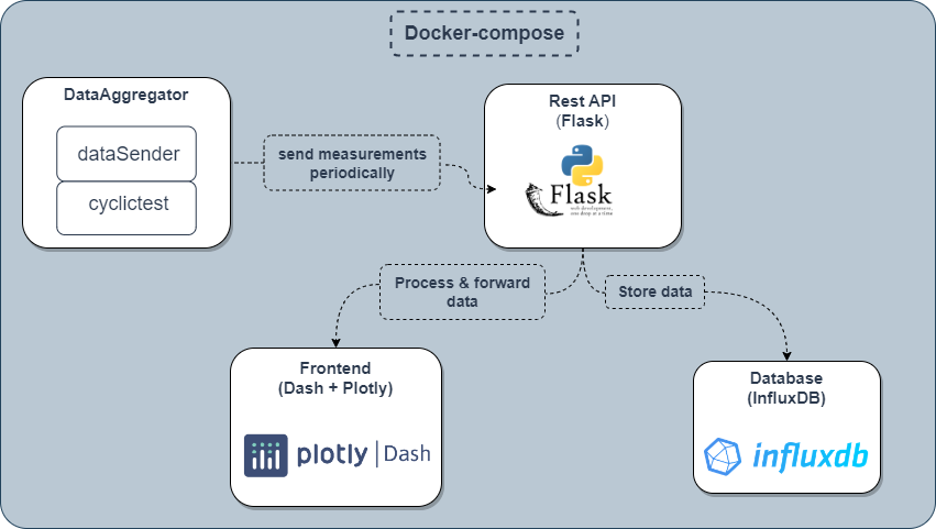 RT performance monitoring system design as a docker-compose flow chart
The containerization of the system microsservices allows for easy deployment and scaling.
Technologies
The technologies used in this project are:
Rest API
The Rest API is written in Python and uses Flask as a web framework to connect the front-end to the back-end. Flask is ideal for building web applications that require near real-time connectivity because it is lightweight, and has a built-in development server and debugger.
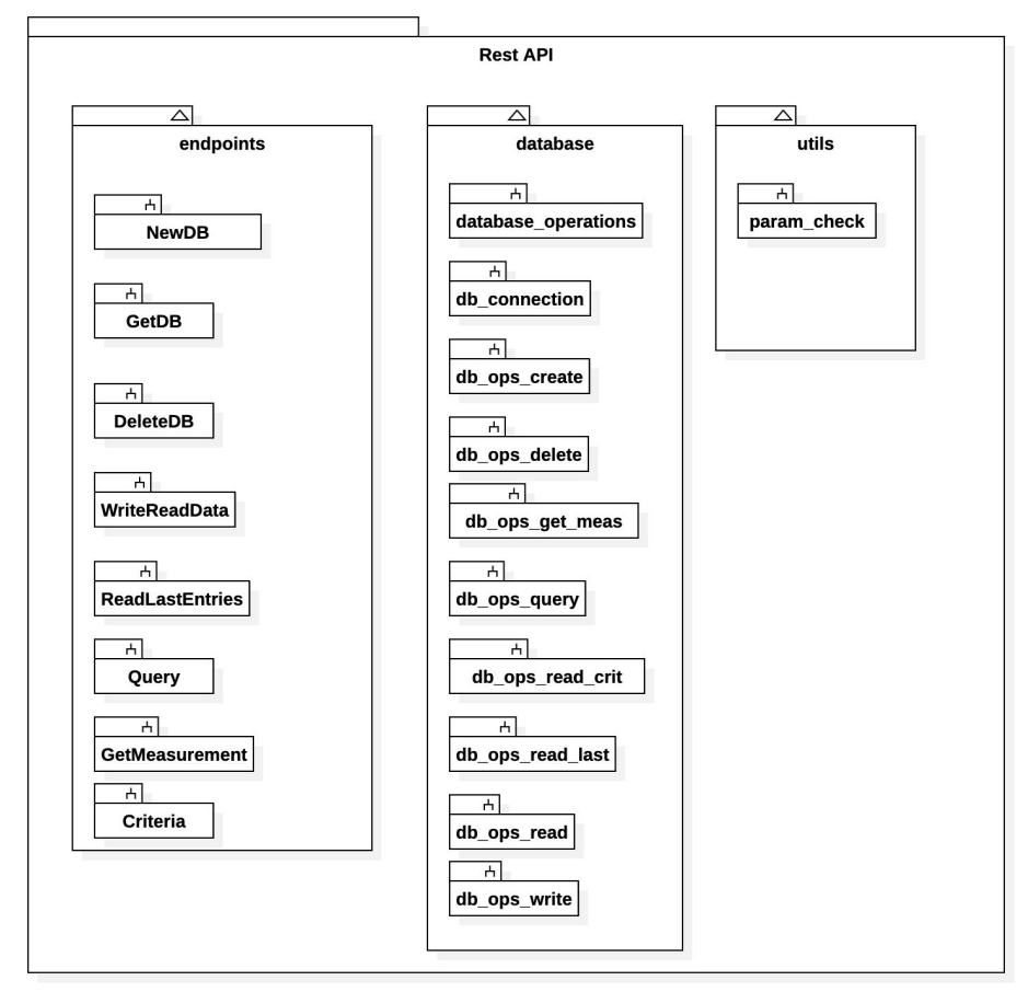 Restful API endpoints diagram
The data structure of the API is as follows:
1
2
3
4
5
6
7
8
9
10
11
12
13
14
15
16
{
    "data": [
        {
            "data_points": [ 12, 250, 43, 3 ]
        },
        {
            "attributes": [
                {
                    "cpu": "2",
                    "priority": "80",
                    "interval": "1000"
                }
            ]
        }
    ]
}
Data Visualization
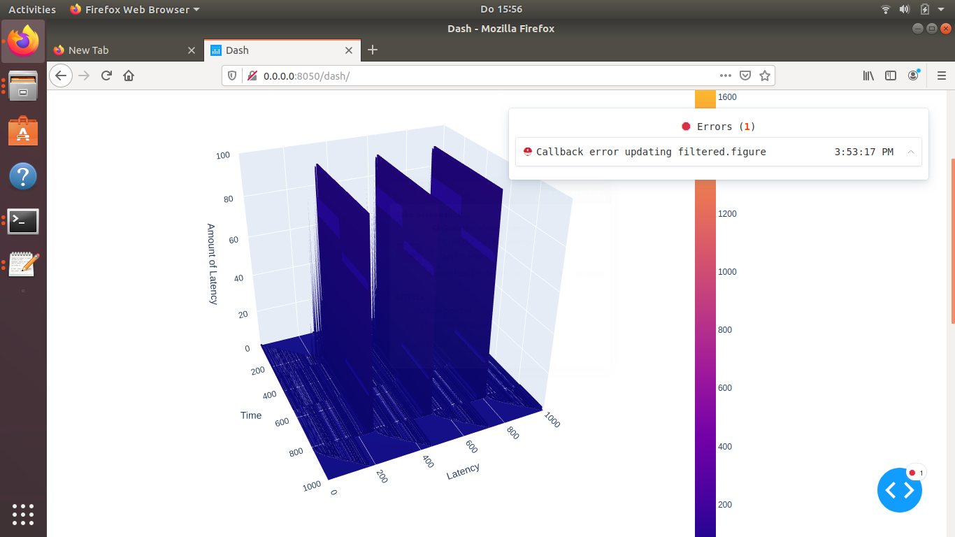
The data visualization is done using Plotly. Plotly is a data visualization library that allows for real-time visualization of data. Plotly provides 3d interactive graphs, and allows for easy customization of the graphs. However, it has proven difficult to maintain the real-time aspect of the graphs when the data is updated at a high frequency.
Data Source
The data source consists of two parts, the data generator and the data sender. The data generator is written in C and is mostly based on the infamous open-source software cyclictest to generate latency measurements from targeted processor cores for a certain amount of time and outputs the data in a file aligned in columns according to the logical core’s number and sorted ascending by latency.
Cyclictest is a tool for measuring the latency of a system under a cyclic workload. Cyclictest is a C program that uses the POSIX real-time API to schedule a thread with a fixed priority. The thread then runs a loop that sleeps for a fixed interval and then measures the time it takes to wake up.
The data sender is Python-based and it’s job is to slice off each columns of the outputted data at a time, marshall it in a JSON formatted package and sends it afterwards to the REST API according to the specified protocols.
Both parts of the data-source module are controlled by a third part making sure both RT-Task(data generator) and the NRT-Task(data sender) aren’t running at the same time. We call the third part data-source for the sake of simplicity and since it’s the main part running and leading the other two.
Running RT-Task and the NRT-Task at the same time would cause inaccuracy in the measured latency readings. It can also cause both tasks, the RT and the NRT to collide and force the program the collapse. That’s why the data-source takes a minor sleep gap while switching from RT to NRT and vice versa, in order to ensure better test accuracy and workflow stability.
Data Storage
The collected real-time data is stored in an InfluxDB database. InfluxDB is an open-source time series database designed to handle high write and query loads. InfluxDB is ideal for storing time series data, such as sensor data, application metrics, and real-time performance monitoring data. InfluxDB is a Go program that uses a custom query language called InfluxQL. InfluxDB is packaged as a Docker container and can be deployed on any Linux machine. Furthermore, InfluxDB has a huge community and is well documented. This is why we chose InfluxDB as our data storage solution.
Patching Linux Kernel for Real-time
In order to benefit to gain the most accurate readings out of cyclictest, we need to patch the Linux kernel to enable the real-time capabilities of the system. The patching process is done by running the following commands:
First, we need to install the Linux kernel headers:
1
2
3
4
5
    sudo apt update
    sudo apt install -y build-essential bin86 kernel-package libssl-dev
    sudo apt install -y libqt4-dev libncurses5-dev pkg-config flex bison
    sudo apt dist-upgrade
    sudo apt install -y linux-headers-$(uname -r)
Next, we download and unpack the linux kernel source code. In our case the kernel version is 5.0.19.
Make sure to replace the kernel version with the one you are using.
1
2
3
4
5
    mkdir rtlinux && cd rtlinux
    wget https://mirrors.edge.kernel.org/pub/linux/kernel/v5.x/linux-5.0.19.tar.xz
    wget https://mirrors.edge.kernel.org/pub/linux/kernel/projects/rt/5.0/older/patch-5.0.19-rt11.patch.gz
    tar -xpf linux-5.0.19.tar.xz
    gunzip patch-5.0.19-rt11.patch.gz
Finally we apply the patch and compile the kernel:
1
2
3
4
5
6
7
8
9
10
11
    cp patch-5.0.19-rt11.patch linux-5.0.19
    cd linux-5.0.19
    cat patch-5.0.19-rt11.patch | patch -p1
    make xconfig
    grep processor /proc/cpuinfo
    Now build the kernel with -j processors + 1 make -j5
    sudo make modules_install
    sudo make install
    sudo add-apt-repository ppa:danielrichter2007/grub-customizer
    sudo apt update
    sudo apt install grub-customizer
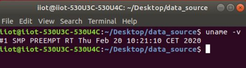
To check if the kernel is patched, run the following command:
1
    uname -v
We should see RT-PREEMPT in the output.
 Checking Linux kernel for RT kernel patch
Most applications and end-users do not need an operating system patched with Preempt-RT, but for the applications that have critically intolerable deadline the patch is a must do in order to make sure deadlines are not passed.
Many linux distributions today already support RT out of the Box.
Results
The results of the project are shown in the following graphs. The graphs show the latency of the system under a cyclic workload. The workload is generated by cyclictest and the latency is measured by cyclictest. The latency is measured for 10 seconds and the data is sent to the REST API every 100 milliseconds. The data is then stored in InfluxDB and visualized using Plotly.
Challenges
Storing time-series in the Database
Every data point needs to have at least one of the following three information differently from any other saved data point: Measurement, time or tags. When a batch of data points are sent in one array, they are registered with the same time, to the same measurement and also with the same set of tags. That meant losing %99 of sent data because only the very last entry would be saved and all the previous data points would be deleted as they would be regarded as duplicates.
The first solution was to add a unique tag for each data point. This unique value was generated using the pairing function. However, this solution had small losses in data when the total amount of data was relatively small, i.e. around 100.000. This solution worked for a while despite small losses in data when the total amount of data was relatively small, i.e. around 100.000. We found that saving data in batches caused catastrophic page loading times. To solve this, we saved each data point with a slightly different timestamp. This reduced the loading time from multiple minutes to under 5 seconds.
Dealing with large amounts of data in real-time
As the amount of data points in the database increases, the amount of time points available for filtering also increases. In the first version of the filtered graph, each time point was available as a filter option. However, this caused performance issues as the list of time entries became larger.
Time entries are now grouped by date, which reduces the number of entries that need to be loaded and makes the page loading time more manageable. This also makes it easier to select a specific time period for filtering.
Setting Up 3D Visualisation
We started with a 3D scatter plot, but found that it was not a clean way to represent the data. We then switched to two 2D graphs. The first one showed what was happening with the data at the latest time period, and the second one showed what the user was seeking to see according to some criteria. The 3d graph needed 20 seconds to render only for 1.000 data points and 35 seconds for 1.500 data points. Even worse, it could not even complete rendering for 10.000 data points in 10 minutes. Our work demands us to be able to process much larger data set than just 1.000 data points.
We then tried a 3D surface graph, but it was very slow and did not improve the data visualization.
Data Collection over virtual machines
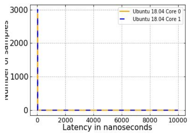
Both Linux images were tested running directly over hardware without middleman as well as on top of virtual machine. Latency readings were collected using the last version of data source module with exactly the same given parameters. The following plots show the amount of finished tasks on y axis at a specific latency point on the x axis (in other words time taken to finish the given task).

As we can clearly see from the figure above Ubuntu running on virtual machine gains no control over Hardware. The used virtual machine in this test is Oracle VM Version 6.1.0 with default settings.
The next two figures show the efficacy of the RT patch between RT patched Ubuntu 18.04 and Windows OS.
 |  |
Conclusion
In conclusion RT-systems aren’t essential for everybody but they have a huge impact on time-critical applications especially in industries depending on flawless time-synchronisation between project components.
Running the data aggregation module on different operating systems gives entirely different results. When running the module on virtual machines or docker the data-source part does not get full control on hardware resources which leads to stagnation when plotting the results as previously illustrated in latency diagrams.
Although virtual machines can send signals to the main kernel in order to gain privileged access to some resources but that does not grant full control of certain resources since it isn’t fully dedicated to the virtual machine and a higher Hypervisor isn’t authorized to control lower Hypervisor in operating systems architectures.